My City is on Fire – Layout Design
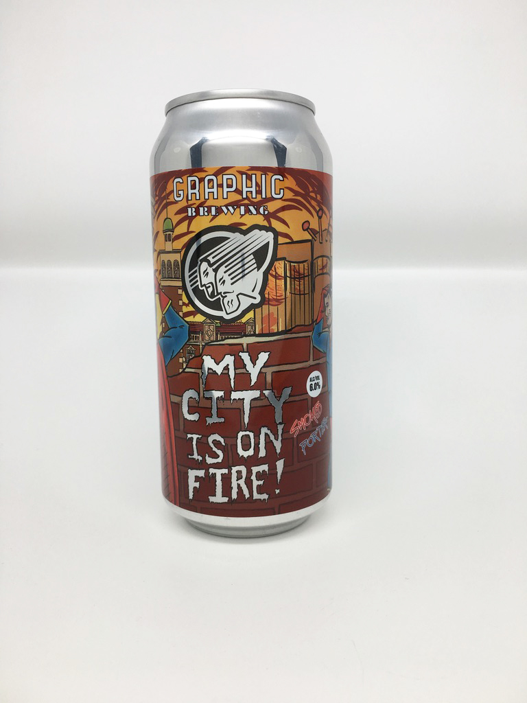
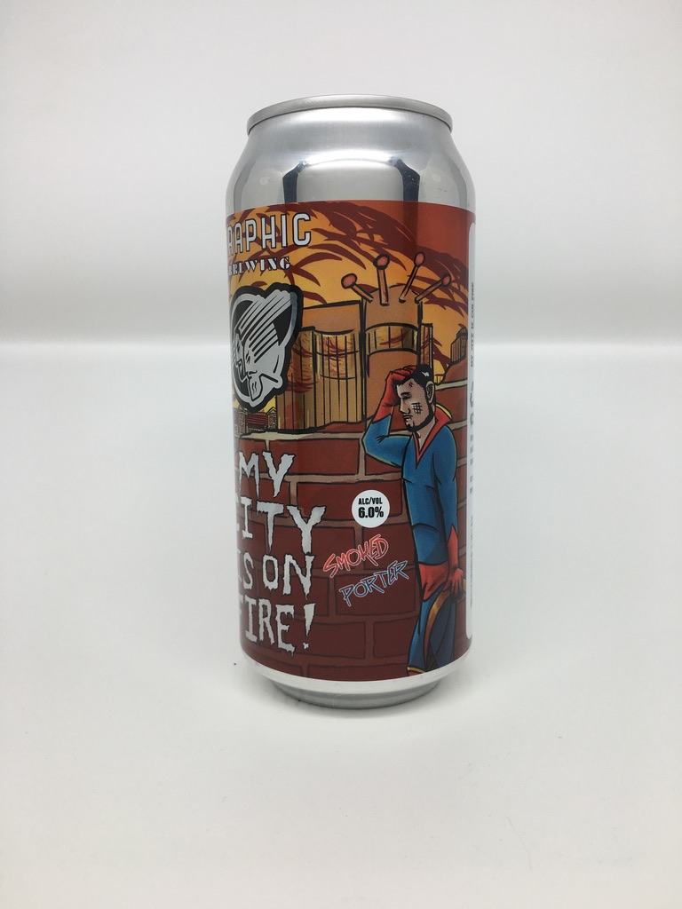
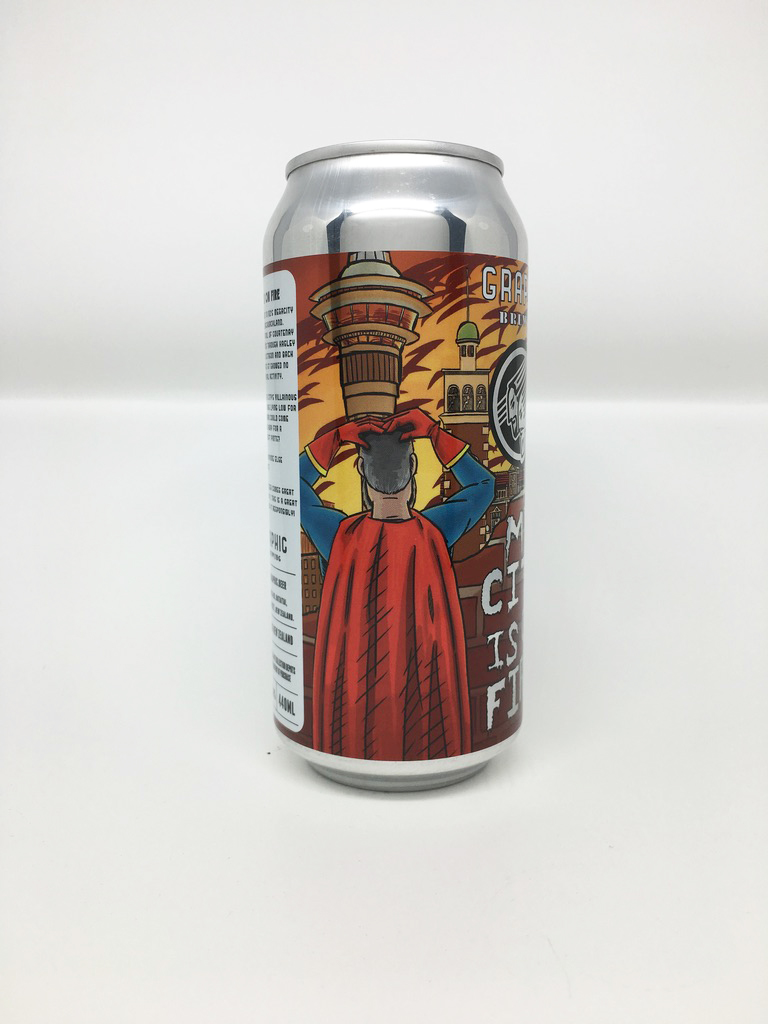
Layout Design of ‘My City is on Fire’ beer can label for Graphic Brewing.
Original artwork was provided by the client in portrait layout.
The original artwork had to be reformatted to fit the rectangular landscape layout of the can label.
Once the characters were separated from the background, there were large gaps in the artwork. This meant that much of the image including many of the buildings had to be painted in the style of the original artist.
The client was keen to utilise the transparency of the labels, so the cloud and the building windows were designed so the silver of the can underneath would show through.